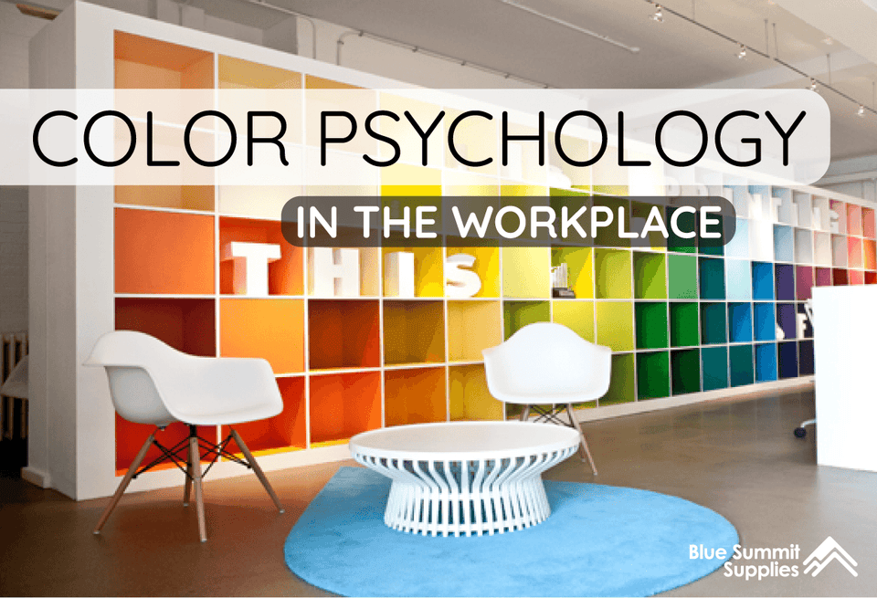
No matter your industry, giving employees a workplace a place they want to be in is key. We’re deconstructing the idea of the ideal workspace even further by getting down to the brass tacks: colors. Specifically, color psychology in the workplace.
You’re probably familiar with the effects of color psychology even if you aren’t aware of it, since certain colors are so ingrained with meaning in our daily lives. Green means ‘go,’ red means ‘stop,’ white means ‘new,’ black means ‘bold.’ There are all kinds of associations when it comes to different colors, but where do they come from? And, most importantly, how can you use these associations to create more positive workplace environments?
Let’s break it down.

How Does Color Psychology Work?
Color psychology is rooted in the idea that certain colors evoke certain emotional responses or feelings. According to the Institute for Color Research, “Research reveals that all human beings make an unconscious judgment about a person, environment, or item within ninety seconds of initial viewing and that between 62-90% of that assessment is based on color alone.” But where do these ideas come from?
Biology makes up a large part of it.
“Researchers have suggested that color associations may have been formulated early in human history when man associated dark blue with night, and therefore, passivity and bright yellow with sunlight and arousal.”
These deep-rooted biological cues have an impact on which emotions certain colors evoke, such as light blue being soothing (think calm oceans, clear skies), orange being motivating (think fire, heat), and very bright colors being attention-grabbing (think aposematism).
Over time, these biological predispositions to certain colors have become ingrained in our modern society. For example, thanks to stop lights, everyone knows ‘green means go,’ ‘red means stop,’ and ‘yellow means proceed with caution.’ This color-trio meaning influences everything from classroom and workplace organization to soccer penalty cards.
All of this to say, before you settle on a color scheme for your workplace, consider the psychological effects of certain colors and color schemes. Picking a color you like is just fine, but if you really want to drive your dollar farther, consider the impact your color psychology in office design could have on your bottom line in terms of employee productivity, motivation, and mood.
Getting the Right Color
According to Angela Wright, a world-renowned color psychologist and creator of the color affects system, it isn’t always the color itself that influences your mood and behavior. Instead, the intensity of the color can have a bigger impact.
“What defines whether a color is stimulating or soothing is not the color, it’s the intensity. A strong bright color will stimulate, and a color with low saturation will soothe.”
Wright also introduced the idea that each color “affects a different part of us. […] The four psychological primaries are: red, blue, yellow, and green. And they affect the body (red), the emotions, the ego, and self-confidence (yellow), and the essential balance between the mind, body, and the emotions (green).”
There are three different classifications of color. For a color to be classified in one of these classifications, it must be a pure color. A pure color is unmixed with anything else which could alter its tint, shade, or tone, and is considered to be in the purest form.

Primary Colors – Red, Yellow, Blue
These are the three basic colors that form all other colors.

Secondary Colors – Purple, Orange, Green
These colors are made by mixing the primary colors together.

Tertiary Colors – Magenta, Violet, Teal, etc.
These colors are made by mixing secondary colors together.

Coloring Your Office
With all this in mind, how do you approach choosing colors for your workspace? The decision for how to apply color psychology in the workplace comes down to what you want to achieve. Here’s a breakdown of colors into three categories: warm, cool, and neutral.
Warm, Cool, and Neutral
According to ColorPsychology.com, “Warm and cool colors are categorized as warm and cool due to the feelings that one gets when looking at the hues. Reds, yellows, and oranges are evocative of the sun and fire. Therefore, they tend to convey a sense of warmth and comfort. Cool colors, on the other hand, are reminiscent of earthy objects, such as grass and water. These hues often feel cool and refreshing, much like the outdoor areas that they are associated with. Incorporating a mix of warm and cool colors will provide a balance and a more defined contrast between the different hues.”

Warm Colors
If you want to give your office a cozy, homey feel, you will likely want to incorporate warm-toned colors. Colors like reds, yellows, oranges, and red- or gold-shaded browns are great ways to achieve this comfortable feeling.
Red Color Psychology
Red is a dramatic, fiery color most associated with action and passion. Says Color Psychology, it “can often be linked to strength and power. Its color can help excite the emotions and motivate people to act, plus [it promotes] ambition and determination.” Red is also used to evoke love and intimacy.
Associations with Red
Positive: Courageous, enthusiastic, passionate, powerful
Negative: Angry, dangerous, pugnacious, forbidden
Yellow Color Psychology
Yellow is a sunny, happy color that can be used as a powerful accent color when brightened, or used as a soothing, all-around color when lowered in intensity. A lower-intensity, buttery yellow is a cozy way to reap the benefits of yellow’s positivity without being overpowering and causing subconscious anxiety, which might be the case with a brighter, louder yellow.
Associations with Yellow
Positive: Optimistic, creative, enlightened, curiosity
Negative: Impulsive, jealous, wary, weak
Orange Color Psychology
Orange color psychology is pretty straightforward – warmth and energy – and it is often a more eye-catching color than the rest of the warm color family. It can be a good statement color for all-over use if tastefully done, or a powerful accent color. Like we mentioned before, shade is important but so is intensity. Orange might seem like a ‘loud’ color, but you can soften it but getting a lower-intensity shade.
Associations with Orange
Positive: Energetic, enthusiastic, cheerful, exciting
Negative: Trendy, loud, cautionary, aggressive
How to Use Accent Colors
Here are a few recommendations for using color in office environments as accents colors.
Furniture. Pick some furniture to be a certain color and use it consistently around your office. If you have an open office space, choose yellow desk chairs for all your employees, or a fun bright filing cabinet.
Desk Accessories. Try using your accent colors with desk organizational systems, fake plants, or notepads. This is a great way to incorporate some energetic colors into your office in subtle and simple ways.

Computer Accessories. If your office uses laptops, buy a certain color laptop cover for the whole team. Try purchasing a certain colored mouse or a keyboard cover.
Wall Décor. Your office needs decorations, so kill two birds with one stone. Select wall décor for your office includes your accent color of choice. Whether that be the frame of your office pictures, or your wall art, you can easily integrate some pops of color.
Cool Colors
If you’d like your space to be soothing and relaxing, embrace the power of cool colors. Colors like purples, blues, and greens can synthesize the peacefulness of nature and help set your colleagues or clients’ minds at ease.
Purple Color Psychology
Purple is a versatile color that can evoke different feelings depending on shade and intensity, just like all colors. With purple, however, a deep, rich purple can have a stronger soothing impact and carries implications of trust, richness, and calm. Says Color Psychology, “When you look at purple in a psychological manner, it is the color that balances red and blue. Red tends to bring intensity and energy to the color, while blue brings relaxation and stability.”
Associations with Purple
Positive: Royal, luxe, brave, wealthy
Negative: Mad, eccentric, selfish, indulgent
Blue Color Psychology
Blue is a color that often is used to signify nature and depth thanks to its natural occurrence in both oceans and skies. The color blue has been linked to boosts in creativity. According to Color Psychology, “It has been proven that different shades of blue can improve concentration, stimulate thinking, and provide mental clarity. It also improves productive, making it a great color to surround yourself with when studying and working. Blue has a weird way of both relaxing a person and stimulating them at the same time as well.”
Associations with Blue
Positive: Peaceful, serene, wise, loyal
Negative: Apathetic, cold, depressed, detached
Green Color Psychology
Green is a color associated with newness, innovation, and nature. It stirs up positive emotion such as success, growth, and wealthy, and it is the one that occurs most naturally around us. Green is both recharging and calming, and is a good color for a fresh, positive space.
Associations with Green
Positive: Fertile, lush, young, fresh
Negative: Envious, greedy, inexperienced, sickly
Neutral Colors
Neutral colors are those colors that exist in the background and are often thought of as the ‘absence’ of a ‘real’ color. White, black, and gray are the neutral colors most often adopted by workplaces, and each has their own unique impact on its inhabitants.
White Color Psychology
White has long been a color symbolizing newness and purity. It is a fresh, optimistic color, a palette for ‘anything to happen.’ “It is considered to represent perfection […] like a piece of black white paper. It leaves the mind open and free to create and fill it.” It is the neutral color which allows for the most versatility in accent colors, and a good starting point for a bright, clean, minimalist workspace.
Associations with White
Positive: Pure, clean, soft, simple
Negative: Fragile, weak, dull, blank
Best Light Color for Office Space
Choosing the lighting in your office is as important as choosing colors. Lighting will change the way color is perceived, but it can also cast a color tint on the whole room. There are two basic divides to lighting: warm and cool tones. Warm tones have a stronger correlation to a cozy and home-style vibe. Cool lighting feels brighter and makes a room more vibrant and alert. Either extreme is not ideal for your office; instead, you should settle on lights between 3500 Kelvin – 5500 Kelvin.
Instead of looking for the best fluorescent light color for office, consider LED options. LED lights fall on the Kelvin scale between 7000 – 2700 Kelvin, so find one that matches the ideal light tone.

Gray Color Psychology
Gray is a true neutral in that it is a mix of both black and white and can fit in anywhere. Gray as a backdrop color can allow you to use several other bright colors as accent colors, with gray grounding them all and tying the scheme in. According to Color Psychology, gray is a the true ‘blank slate’ color, allowing those experiencing to project their own emotions onto it: “ It truly is unattached, neutral, impartial.”
Associations with Gray
Positive: Balanced, secure, trustworthy, reliable
Negative: Cloudy, aged, sad, moody
Black Color Psychology
Black is the strongest of the neutral family and, if used effectively, can be a calming, grounding color for your space. However, it can also overwhelm a space. According to office wall color psychology, painting all of your walls black color will make your space feel smaller and potentially claustrophobic, unlike white which makes a space feel larger and airier. However, tricks like accent walls are ways to reap the benefits of a color like black – a sophistication and modernism – and can help make your workspace more polished.
Associations with Black
Positive: Powerful, elegant, sophisticated, formal
Negative: Negative, secretive, evil, mournful
Color Schemes
As mentioned above, Angela Wright’s school of color psychology asserts that you can use several different colors to achieve the psychological effects of those colors simultaneously. Finding harmonious, complementary colors to work together in decorating is often referred to as finding a ‘color scheme’ or ‘color palette.’
A good way to do this is to reference complementary colors on the color week, as mentioned above. Play around with the colors that go together and create a palette that speaks to your brand or vibe.

Warm Source / Cool Source / Neutral Source
Orange/Blue Source / Yellow/Purple Source
Get in the Mood: Creating Color Mood Boards
Stumped on how to choose what for where? Check out colors and color schemes before you commit to them by creating mood boards. There are all sorts of tools and sites that give you examples and resources of how certain colors and color palettes look. Pinterest is the most popular since it’s a goldmine of user-created content covering every aspect of home improvement, though you can always go old school and create your own physical mood board using cut outs from interior design magazines and a corkboard!
What do you think about color psychology? Let us know! Reach out on Twitter, Instagram, or Facebook with your thoughts on the best color schemes for the workplace. And if you have any questions or concerns, send as un email. Larry is always happy to hear from you!
Cover Image Source
 For more informative articles about office supplies, subscribe to our email newsletter!
Never fear, you won't begin receiving daily sales emails that belong in a spam folder. Instead, we promise a fun weekly roundup of our latest blog posts and great finds from across the web. And if you lose interest, it's always easy to unsubscribe with a single click.

